Urban Technology at University of Michigan week 172
Appreciating Cornell Tech Urban Tech Summit + Reading the Google HQ
The first half of the week was Cornell Tech's Urban Tech Summit, an annual event now in its third year and comfortably exerting its own gravity. Though often NY-centric in its content, the event provides a view into the thriving ecosystem in that region at the intersection of technology and the built environment. It is informative regardless of your geography. Entrepreneurs, policymakers, funders, and academics shared their work in decarbonizing the city through things like carbon capture concrete, better and cheaper aerial imaging, funding clean energy, and creating spaces of fervent collaboration.
It was, at times, overwhelming just how much work is being doing in NY and how disparate all of the takes were. But then again, the city alone is one of the world's largest economies. If they weren't doing a lot something would be amiss. And if it were all perfectly coordinated and congruent, that wouldn't be very NYC, would it? I left Roosevelt Island with a renewed focus on finding the Michigan way when it comes to urban technology. What's our Arsenal of Democracy 2.0—this time directed at the threat of anthropogenic climate crisis? A topic that requires much inspiration, indeed.
Three thousand miles away and fortified by a surprisingly tasty breakfast sandwich, I am catching up from a week of travel and thinking about where inspiration comes from. If we want our students to someday invent the "next next" for urban life, a term used by Jerry Hultin at the conference, one thing they will need is the ability to find hints of the extraordinary in the now. To do that, we look, and look carefully.
I’ve been immersed in curricular edits recently, honing the ways in which we teach our students how to see the city for what it is and what it could be with equal weight. Observation is not the only tool, but it’s a good start. Since I happen to be sitting in Mountain View, CA this week's newsletter is an exercise in seeing. Let's look together at Google's sea creature-shaped HQ, shall we?
💬 Hello! This is the newsletter of the Urban Technology program at University of Michigan, in which we explore the ways that data, connectivity, computation, and automation can be harnessed to nurture and improve urban life. If you’re new here, try this short video of current students describing urban technology in their own words.
🪸 Unusual Atoms
Whether at the scale of a building or a phone, studying the material reality in front of us is one of the easiest and most readily available means of making sense of the world. Insofar as we look carefully and find material realities that are uncommon, we find an invitation to understand why the status quo was deemed “not good enough” and in which ways that might be true. To design and invent new technologies, we have to understand humans and their organizations. Observation is one of many tools we used to do that, working backwards from the material reality with the sensitivity of an anthropologist. This is why we’re always on the hunt for unusual atoms.
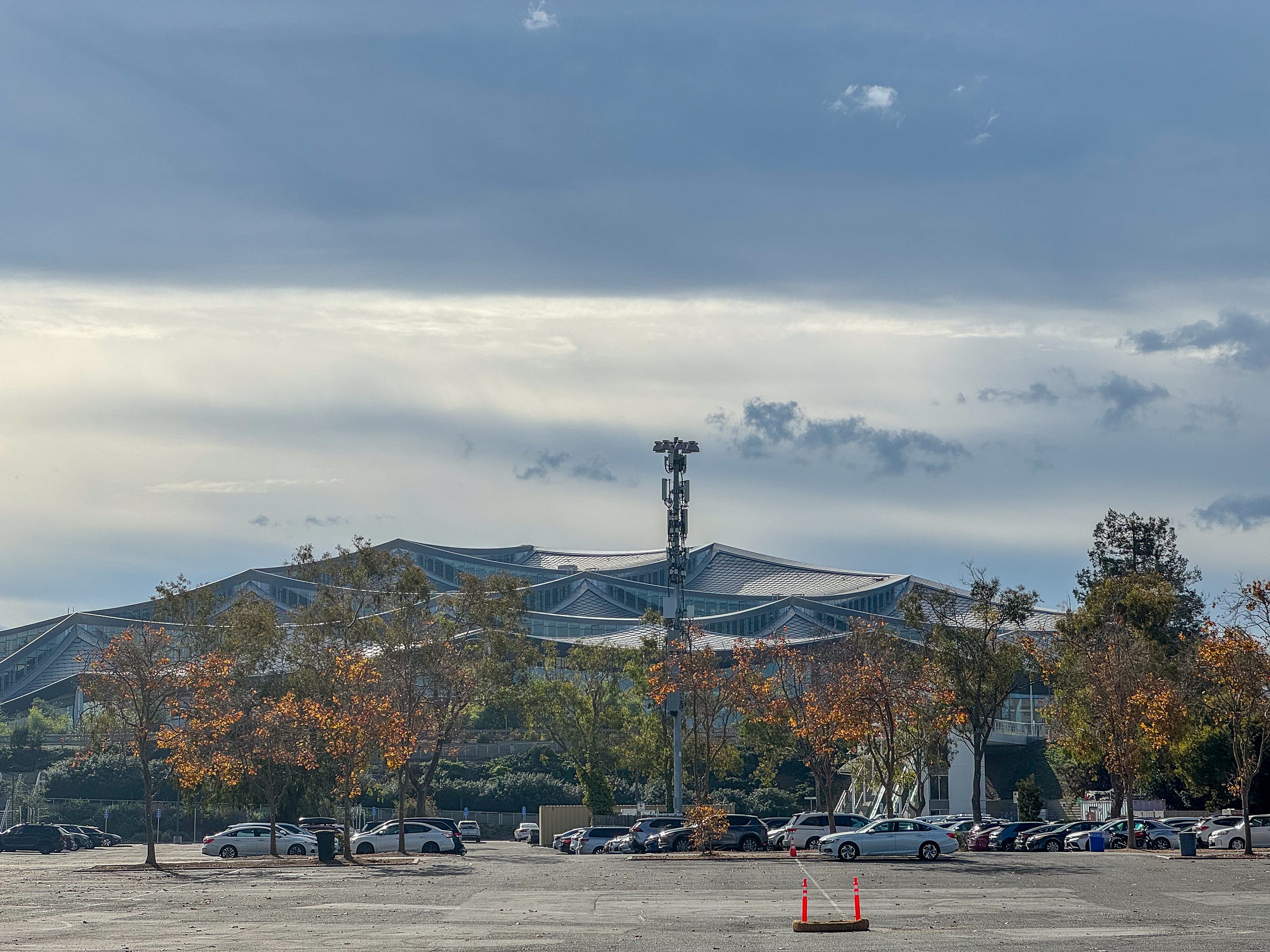
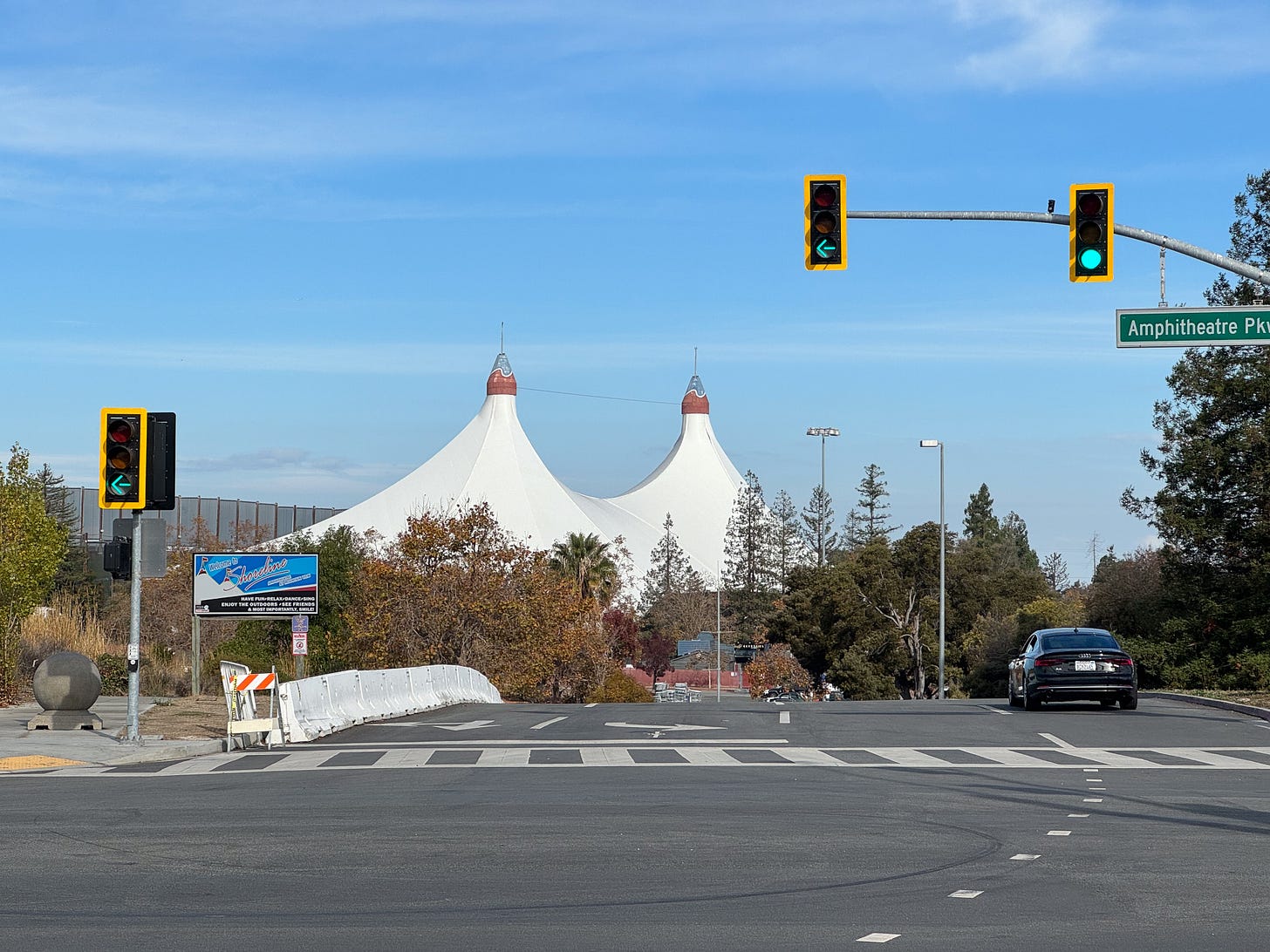
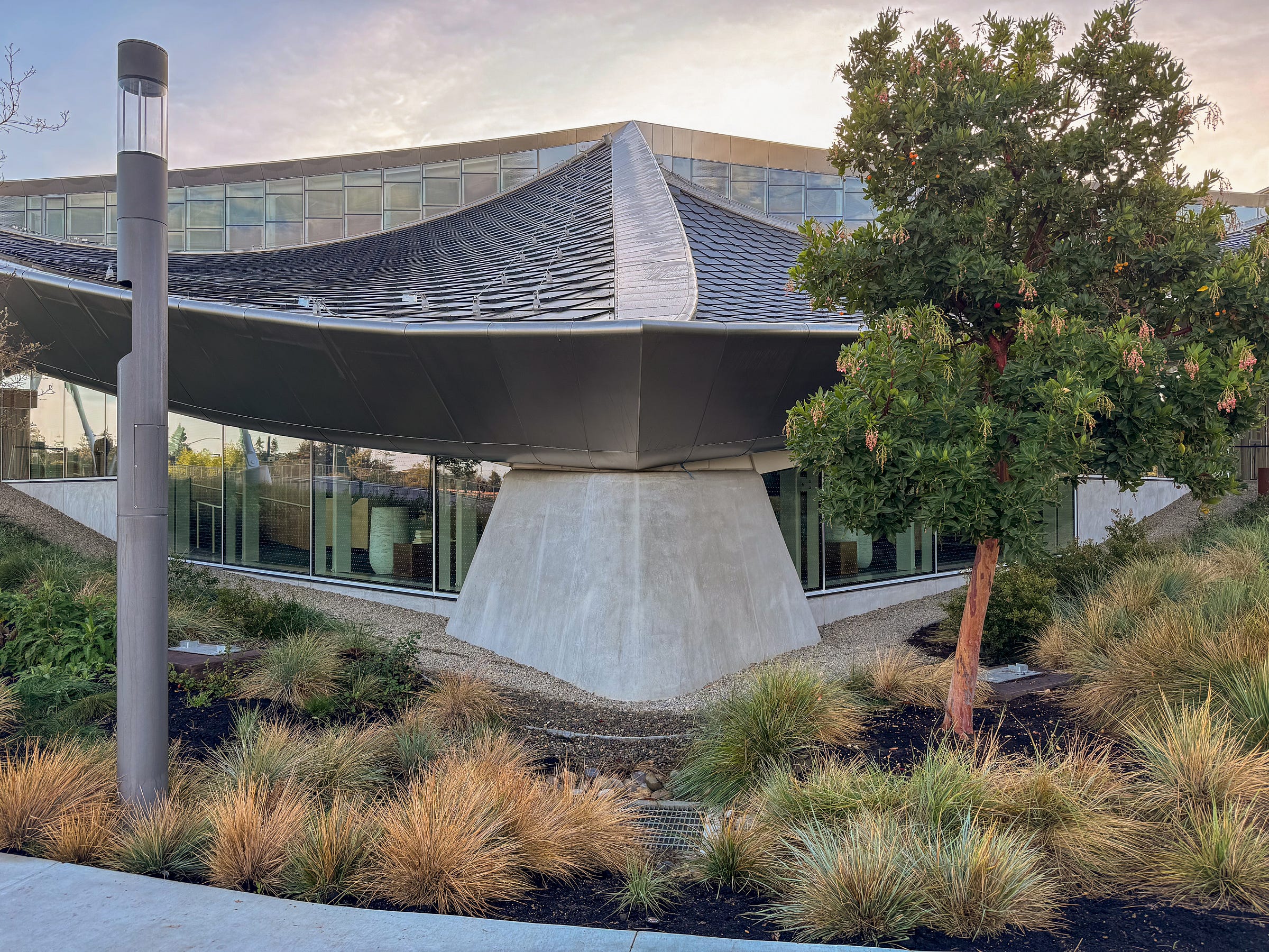
From space Google’s new HQ looks like grey meringue. In bird’s eye view it’s a rare building. From the street you might be tempted to say it looks like a tent, and perhaps the architects that designed the structure were inspired by the catenary structure of the Shoreline Amphitheater that has stood nearby for decades.
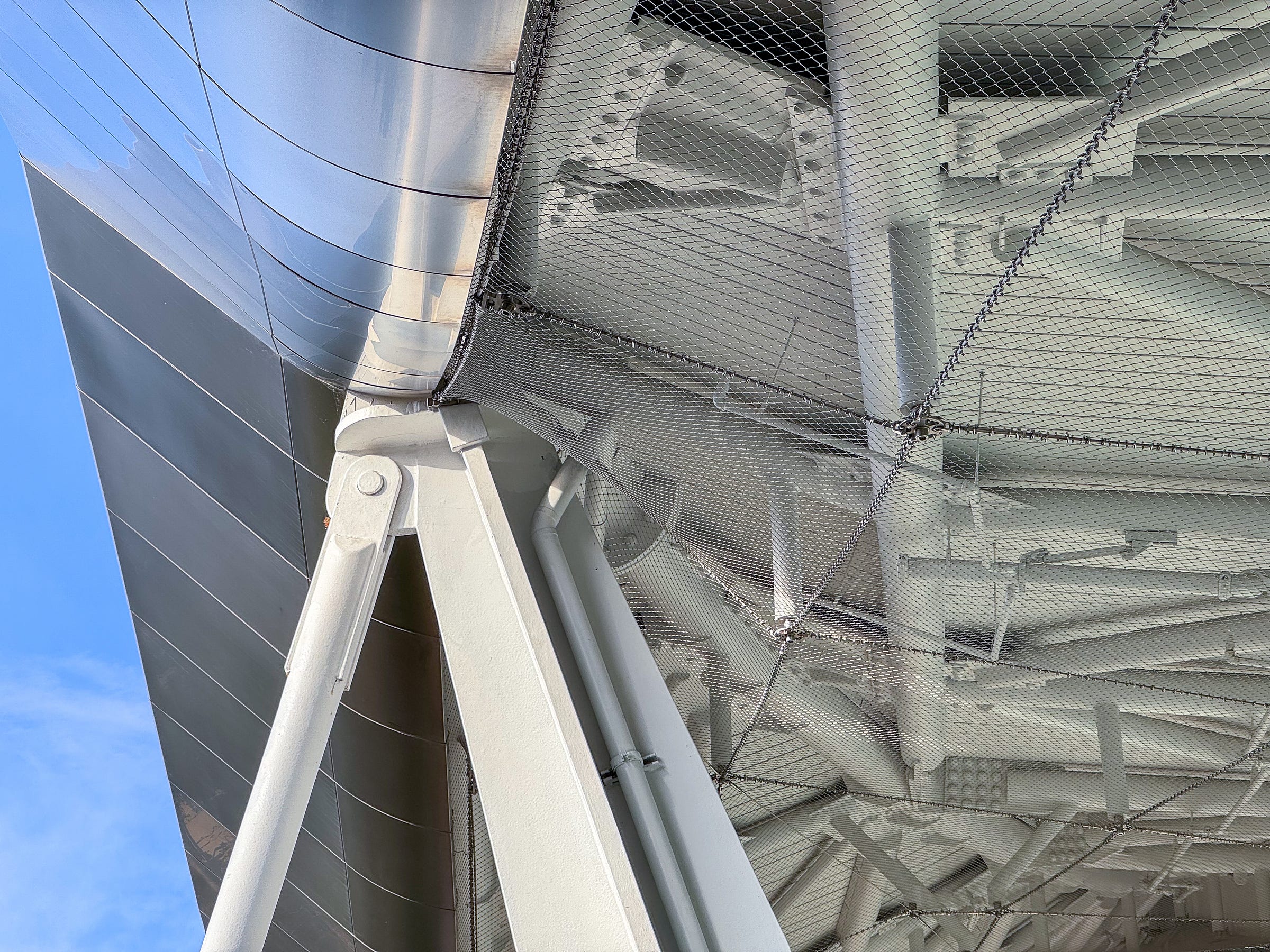
Though the silhouette of the Google HQ “Gradient Canopy,” as they call it, looks relaxed, that appearance is carefully constructed. Looking up under the rim of the diaphanous roof structure reveals a criss cross network of steel that holds everything just so. Look carefully and you can see a fine wire mesh installed to keep birds from finding snuggeries amongst the geometry. This tells us that the designers wanted the underside to be exposed. The exposed outer rim of the canopy is like view-source on a web browser. Behind the smooth and calculated image of tented canopy the guts are open to you, if you care to see them.
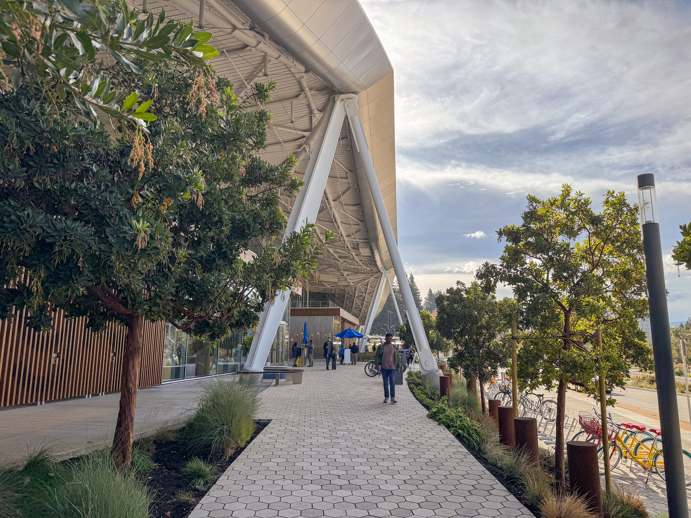
The high points of the roof’s edge are held aloft by a series of large steel braces shaped like upside down V’s that straddle walking path that veer from the sidewalk up to the building’s entrances. In this way the architecture plays a role in wayfinding. It feels friendly. We look for feels by looking at ourself. How do you feel right now, standing here, looking at this building? What does its material reality make you think about or incline toward? Your answer wont be the same as the person next to you, but that’s OK.
At low points, the roof comes down to concrete piers that visually rhyme with the legs of Eero Saarinen’s TWA pavilion at JFK airport. Indeed, the whole roof feels like an homage to Saarinen’s work. At the North Christian Church in Columbus, IN the roof’s hexagonal geography is made visible, inviting you to follow its lines to the spire. The same move is in play at Saarinen’s Yale hockey arena. Here the dip of the roof gives the passerby a view of the photovoltaic “scales” layered atop the building. These help power the structure and it hardly feels like an accident that they’re made easily visible from street—and Streetview™—level. The building as a project is didactic throughout.
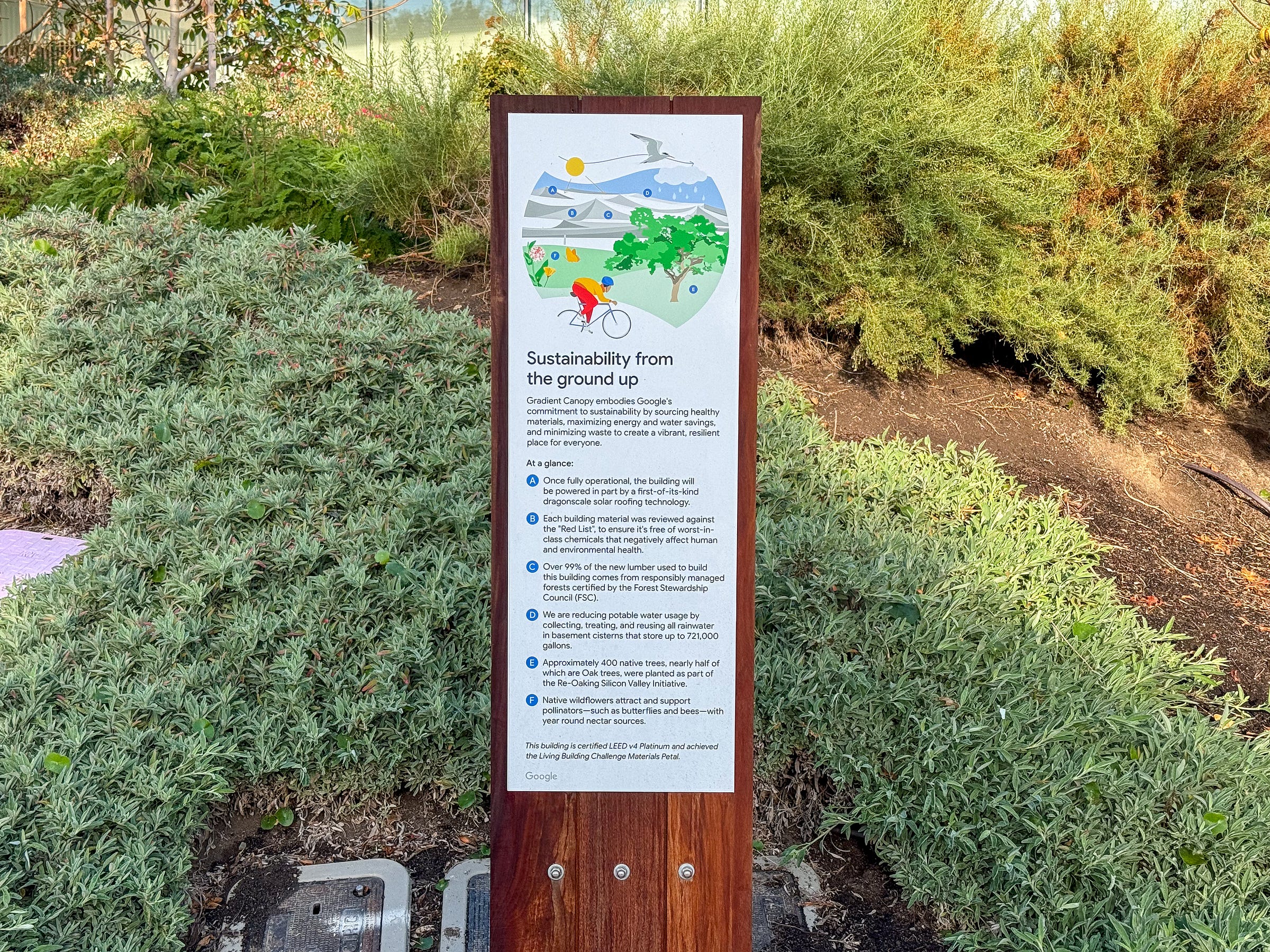
Well-designed monoliths around the perimeter inform the visitor about the story of the public art and the details of the sustainable systems. You have to be told because these details are beyond the visible spectrum. They’re about things like supply chain choices and performance standards. Look at a highly off-gassing building material and it’s not likely to look any different from a non-VOC material. In the 21st century, invisibles choices are some of the most important made in the composition of any object, whether a tech HQ or a USB cable. In a world of invisibles, annotation must be on by default.
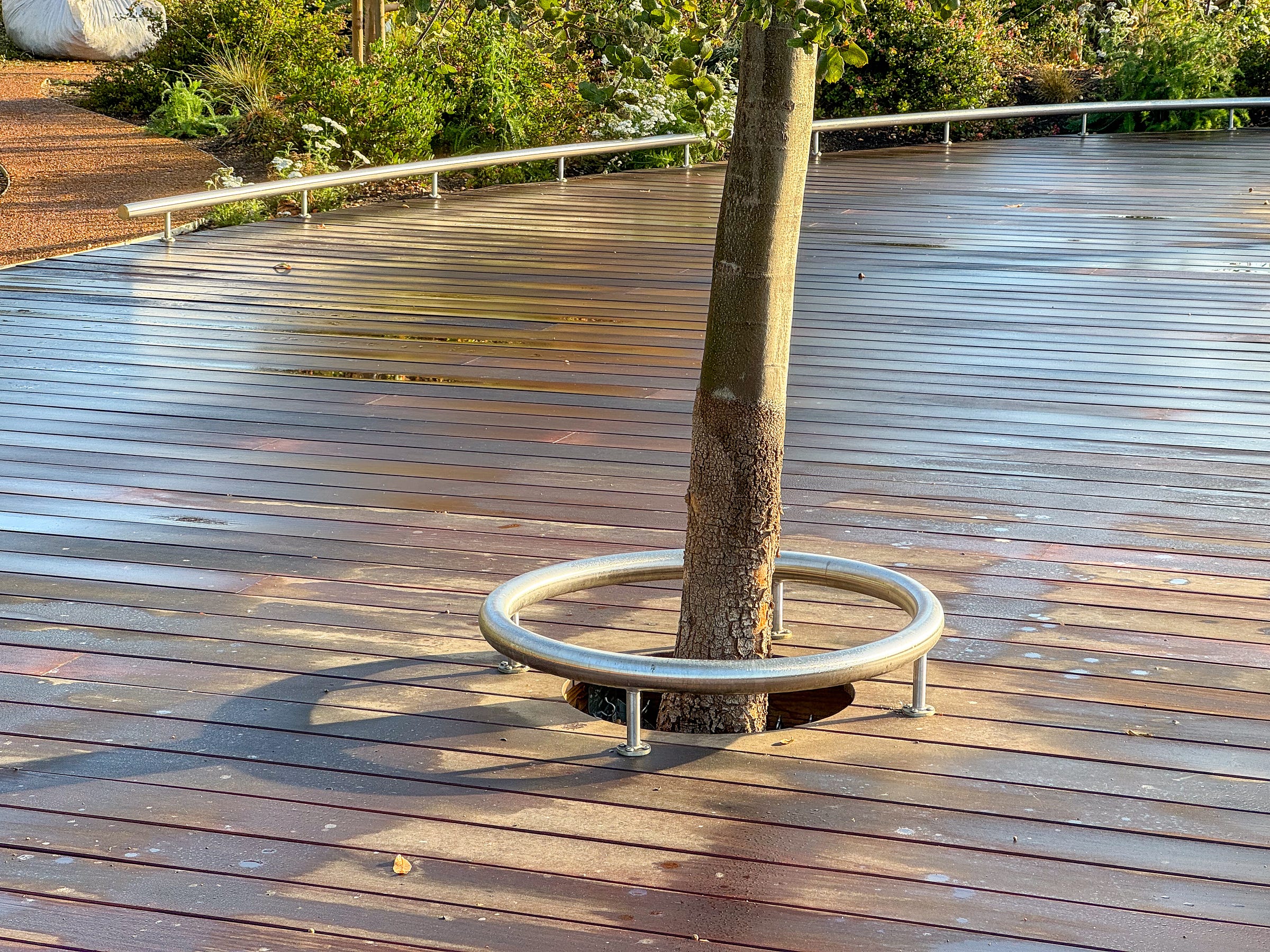
From the intricate roof structure to the smallest details of the landscape architecture, everything here is designed from scratch. This makes it a very special place, just by virtue of how rare it is to have that much freedom (and obligation) to specify every tiny detail. Something as small as the barrier around a tree pit begs the question, what shape should it take? What’s the perfect expression for the protection of a tree and the notification of vision-impaired visitors that they have found where the sidewalk ends? In this case I’m tempted by the thought that the anonymous designers who were given this task decided it was an opportunity to make a joke on the headquarters of a certain other local mega corporation. I’m kicking myself for neglecting to check if this silver ring was protecting an apple tree.
All that ability to design each little facet means that close up, the building creates its own world. The close reader will note that I’ve neglected to mention the interior of the structure, and that’s because I did not have access. So complete is the narrative universe of this building that we can blabber on this long just about its exterior periphery.
Looking for how the building sits in context gives us a chance to understand how it relates to the world. Is it sympathetic to the status quo or does it stretch the now? The sidewalks and cycling lanes signal that non-motorized mobility has been taken seriously as part of the project, a positive stretch here in America. This also means that the building was considered as something more than an object—a smart move, given the number of people for which it was designed to provide workspace. But motorized mobility is also on view, of course, and even on a brief visit it’s hard not to notice the large private coaches used to shuttle employees to the building in lieu of public transit.

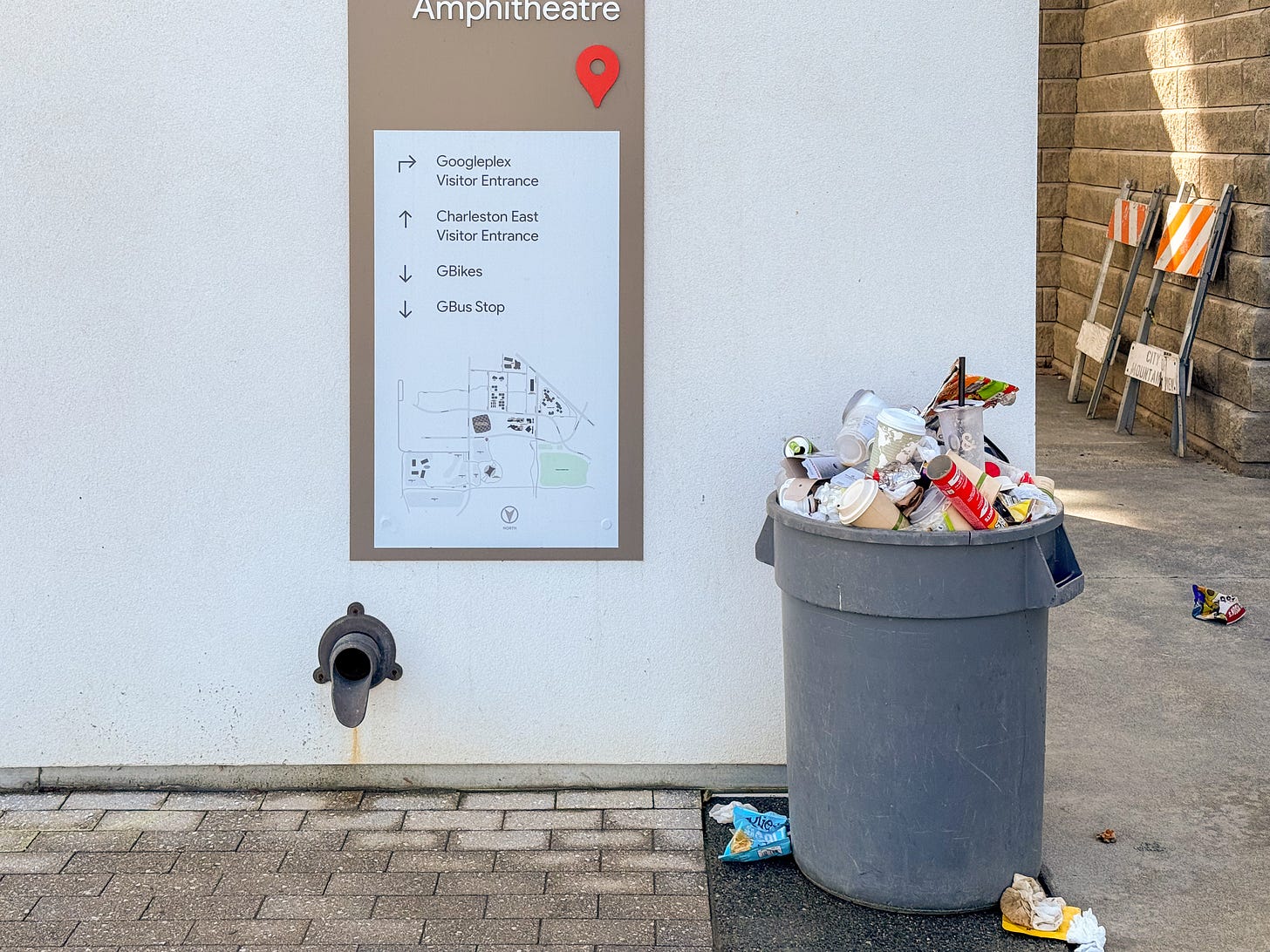
Even unified wayfinding cannot mask over the fact that in the parking lot you occupy a different geometry, different materials, and different color palette. This all says you’ve found the edge of the world implied by the building. You’re outside the bubble. The falloff feels stark here, an urban equivalent of the complaints that Google’s labor force is comprised of salaried and contract employees with sharply tiered privileges and benefits. Even the most intentional act of design cannot escape, nor own the fullness of its context. As an observer, it’s moments of contrast like this that help us understand the thing we’re looking at. Edges and seams show us the real and important struggles of deciding which externalities have been internalized and wrestled with, and which have been accepted as beyond scope. As observers we want to be sensitive to this balance because as creators it will be one of the hardest things to get right.
For more about this building: Google’s own page is very nice, as is this downloadable book.
👨💻 Are you hiring for summer 2024? Reply to this email if you’re interested in having urban technology students join your team as interns. They have skills in UX design, service design, python, javascript and a zeal for urban challenges.
These weeks: Jet streams, conferences, managing. Working on our first course in partnership with a “Real World” Partner (the kind of odd thing that academia makes you say). The kindness of umbrellas. We have a new meme: 2 pieces. 🏃


I happened to play soccer at the "Google Field" a couple weekends ago and what striked me most was how much everything fitted together. The skyline, the means of transportation, the pathways. Even the buildings integrated perfectly with the mountains. The whole campus is great. Every inch was used and thought about. A garden on the parking garage. Buildings that open up just enough to feel free, but still have a sense of community. Modern office buildings with unique amenities.
Being on campus made me feel like everything is perfect. Like there's no problems in the world. Truly fascinating and a great job done by the developers, architects, and everybody involved.