Urban Technology at University of Michigan week 170
Interaction Design + Four Questions for Matthew Wizinsky
Last time we wrote about U-M’s forthcoming Center for Innovation in Detroit and received a bunch of responses from readers. We love hearing from you. If this stuff is interesting, please let us know!
Almost exactly three years ago I was writing about interaction design for the first time in this newsletter. We pick that thread up again today by interviewing one of our newest faculty members, Matthew Wizinsky.
💬 Hello! This is the newsletter of the Urban Technology program at University of Michigan, in which we explore the ways that data, connectivity, computation, and automation can be harnessed to nurture and improve urban life. If you’re new here, try this short video of current students describing urban technology in their own words.
👉 Why Interaction Design
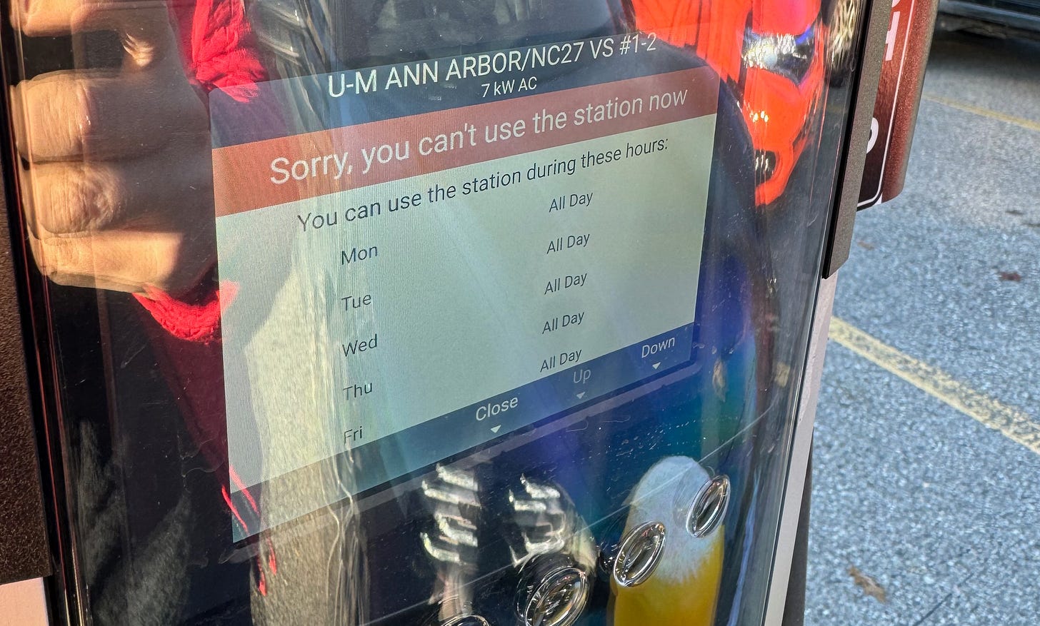
Quick refresher: interaction design focuses on the relationships and interchanges between humans and machines. You’re surrounded by 3.7 screens all day every day (don’t quote me) and daily life is mediated by them and your interaction with them. Even if you’re not the one using a phone/tablet/computer, via an interface, someone you rely on to do something important is doing so—a doctor using electronic health records or someone in a call center peering into a CRM database. When those moments are seamless and easy, that’s good interaction design at work. When those moments are not straightforward, the experience can be confounding, like the EV charger interaction Violet Whitney and I suffered through this week, pictured below.
“You can’t use the station now… but you can use the station…. all day, everyday.” The answer was to click through a warren of menus and sign up for the U-M charging group before trying to use the station. The screen didn’t indicate this at all because the computer onboard was not told to contemplate that this piece of technology is urban—situated in a specific context, subject to specific rules and jurisdiction. 🤯 🫠
New technologies on streets and sidewalks or in homes and offices means new user experiences that have a big influence on everyday life. It’s hard to get this kind of thing right (👆⚡️⛽️)! It’s also still relatively early in the arrival of these interactions on city streets. Go back and look at web-based email prior to GMail to get a sense of how great interaction design can change the usefulness of a thing. The user experience and interaction design of urban technologies are ready reimagining with grace and durability. Desperately so.
Some of our students will graduate and work as interaction designers, refining everyday urban experiences like fixing the EV charger fail above, but many of our students will not be interaction designers. So why do we make everyone take courses in this topic? Because interactions will happen. Where you’re the designer of them, the programmer of them, the product owner of them, the business person desirous of the value that comes from them, or the community advocate calling attention to their failures, interactions are going to happen. We teach interaction design to everyone because regardless of which “hat” they wear in their urban technology careers, everyone needs to be at the very least literate in interactions. Let’s meet Matthew Wizinsky, who’s currently teaching our first (!) course in urban interaction design.
🐡 Four Questions for Matthew Wizinsky
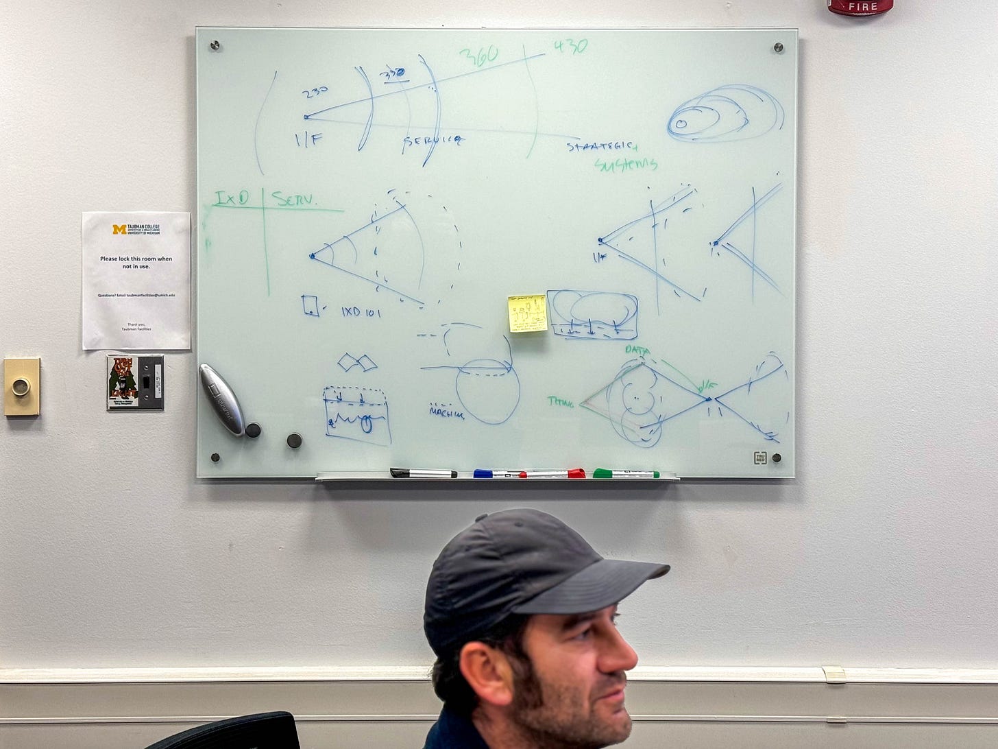
Matthew Wizinsky is an Associate Professor of Practice at Taubman College, where he brings a few different lenses to the work: expertise in communications and interaction design, an interest in strategic foresight, decades of teaching experience. Currently he is also pursuing a PhD in transition design at Carnegie Mellon University. Wizinsky’s first book Design After Capitalism was published by the MIT Press last year and recognized by Fast Company as one of the year’s best design books. Design After Capitalism diagnoses challenges for design practices operating in an evolving information and service economy (aka the economy) and proposes ways for designers to work with greater agency. These are some of the reasons that we’re happy to have him as part of the core teaching team for the urban technology degree program at U-M.
BRYAN BOYER: What do you think changes about visual communication when it becomes explicitly rooted in a place?
MATTHEW WIZINSKY: What excites me about situated work—particularly the work I’ve done using augmented reality rooted in “place”—is that it allows us to at least attempt to come to grips with the infinitely malleable, constantly updating nature of digital interactions as they confront the slow-moving material world of both the natural and built environments.
This is one of the most intriguing and challenging aspects of what it means to design anything—call it “urban technology” if you like—that uses computation and/or data to mediate upon the physical world. How do these (typically) very different time scales of change, update, and/or interaction collide with each other? What new challenges and opportunities does this offer for new forms of participation in the shaping of urban (or other built) environments?
Digital systems and tools, along with the “digitization” of various facets of everyday life, tend to obliterate the local and contextually distinct. But, it need not be that way.
BRYAN: Your work outside the classroom engages with questions of societal scale transition—and particularly climate change. Why is this a topic of design, per se?
MATTHEW: I’m interested in the kinds of “worlds” that design can create—intentionally or not. What do various acts of designing make happen in the world? What kinds of resources do they demand—material resources, energy, technical expertise, information, labor? What new ways of living or doing or working do they put into play? How do designers’ ideas and actions shape and shift everyday life? But also: what assumptions do they make about the world as it is and as it might be?
Recently, I have been exploring how design intersects with “political economy.” By political, I mean the ways power is distributed, and by economy, I mean how resources are allocated. I believe that a significant portion of user experience and interaction design masks the distribution of power and resources that takes place in the making and operation of digital platforms, services, etc. The digital networks we now rely on—like air or language—also have a massive physical footprint as well as massive labor inputs that are easy to forget (or hide).
Over the few decades that I’ve been a designer, practices have evolved alongside the shift from object-based, production economies to non-material, information-, communication-, and collaboration-based value models. Service designers and UX designers now participate in various fields such as healthcare, finance, and government services—spaces where it would have been previously hard to imagine “designers” [being important]. Yet, there they are! However, I don’t believe we have yet caught up in “thinking what we are doing,” particularly when it comes to the mechanics of power and resource allocation in these diffuse areas of practice.
Back to the question: I think these huge issues—climate, social inequity, political economy, democracy—are not design issues. However, because design is participating in shaping lived experiences in and through these issues, we ought to have a decent sense of what we’re up to (or maybe what we’re up against).
BRYAN: You’ve taught the students about research methods using a framework of exploratory, generative, and evaluative. Can you explain this framework and how it’s useful?
MATTHEW: As design has matured as a discipline, it has borrowed, stolen, and even occasionally invented new methods for both making sense of the world (as it is) and generating and evaluating propositions for how it might be different (how it could be made “preferable,” at least for some). Given the expanse of design methods now available, the challenge is often: how to orchestrate methods into a coherent process? The Exploratory / Generative / Evaluative framework gives some coherence. The process is never entirely linear, but it is directional: iteratively narrowing our understanding and response to a situation.
Exploratory methods help us orient ourselves to context: understanding people, goals, behaviors, norms, and expectations; navigating the significant features or aspects of a domain or topic space; and identifying challenges, misalignments, or other opportunities within a particular context. This is also sometimes referred to as “sense-making.”
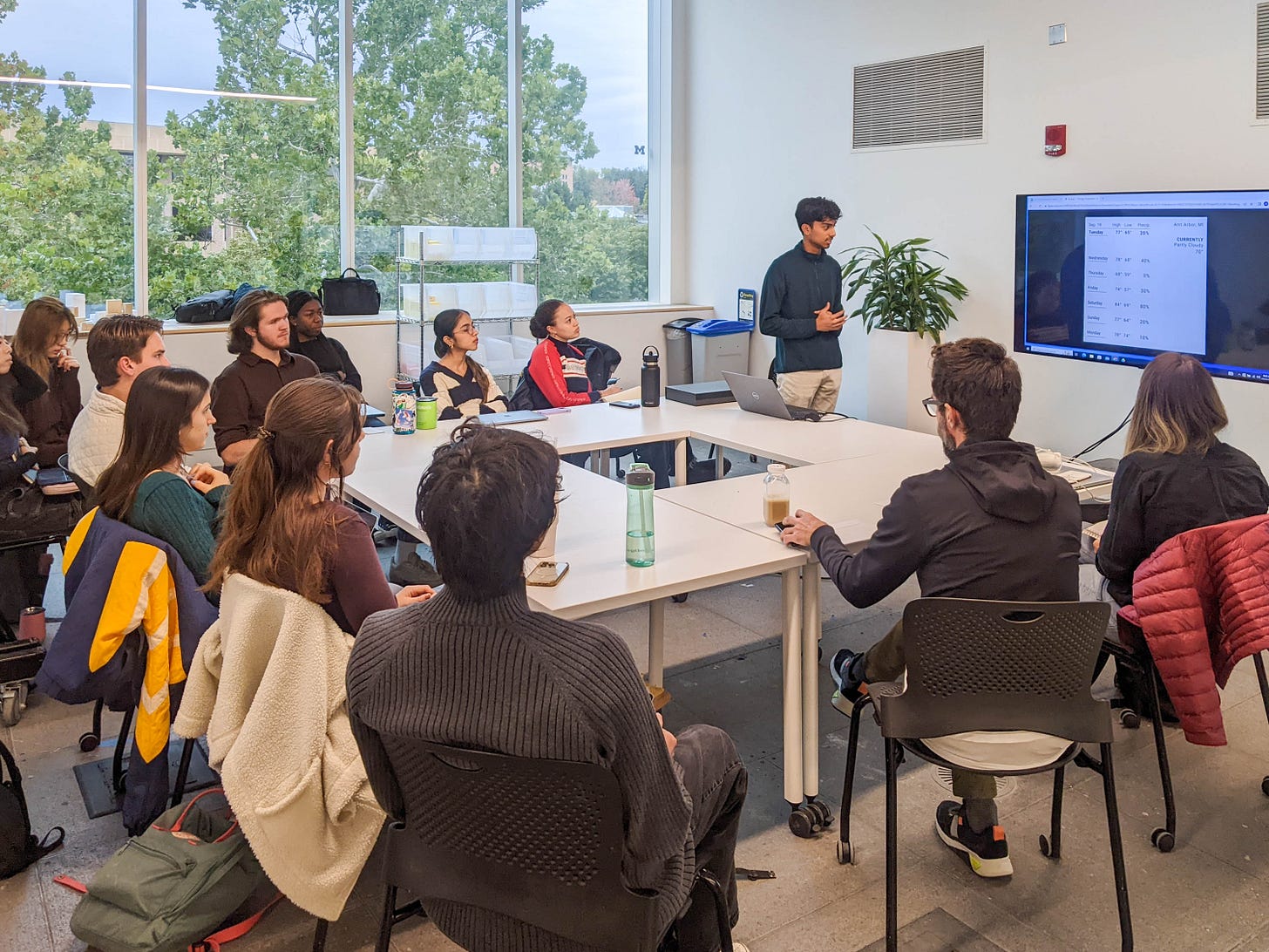
Generative methods help us aggregate and coalesce what we’ve learned from Exploratory methods into something more tangible, or help us generate propositions for interventions. In the UT330 course Design and urban Interactions that I’m teaching, we’re sampling many different methods, but one that I think is indispensable is the Journey (or Context) Map.
Visualizing the orchestration of people, objects, environments, goals, information, touchpoints, and interactions across any kind of engagement with a system helps us pinpoint specific moments for something “else” to take place. My bias coming from a background in communication/information design means I tend to see this through the lens of information and feedback loops: If we inserted a new piece of information [at a certain spot along the journey,] how would that change decision-making?
Evaluative methods offer much more than just “usability testing” (which presumes the “use” has already been fully determined). I see Evaluative methods following a sequence as well. Comprehension: Can people understand what’s going on? Is the visual/verbal language legible? Usability: Can the designated or imagined tasks be completed? Completed well? Are existing goals being met? Are new goals (or challenges) emerging? Desirability: Just because you can use it… will you? In the time it takes? In the context of everyday life in which it’s being proposed?
While all this “research” and “testing” may sound like it would kill the creative joy of design, it’s just the opposite. Design thrives on constraints, and research methods are great at creating or identifying those constraints.
BRYAN: What’s your favorite city and why?
MATTHEW: That's a tough question, and it’s one I probably can't answer. Instead, I'll name a city that truly surprised and delighted me the first time I visited. That is Ljubljana, Slovenia. There is something about the scale of the city and its public spaces, the diversity and (to my eyes) ‘weirdness’ of its architecture, and particularly its combination of beautifully maintained and somewhat seemingly controlled “ruin.” It felt like it was something out of a dream. The city also transformed throughout the day. At night, it seemed as if all of the city's residents gathered in different spaces stacked amongst different tiers along the riverfront. This felt like a kind of social structure that was relatively unfamiliar to my life in post-industrial American cities.
👨💻 Are you hiring for summer 2024? Reply to this email if you’re interested in having urban technology students join your team as interns. They have skills in UX design, service design, python, javascript and a zeal for urban challenges.
These weeks: Verifying RAL swatches, assembly timelines and crews, and confirming orders. St-st-studio. Nailing down parts of Winter. Happy about the autumn leaves, but/and wow, autumn leaves already, huh? 🏃


