Urban Technology at University of Michigan week 186
Celebrating UT Studio Space Mark II - on bread and magenta powder coating
“Enchantment—a useless thing, but as indispensable as bread,” says Gio Ponti, famed Italian architect. Was he talking about the bright magenta powder-coated details of our new studio space? Sadly no, but he should have been! In this issue we’re doing a show and tell of the new “studio” classroom space we built our over the winter and checking in with Laura Peterson, architecture faculty member and founder of 1+1+ Architects, who designed the space for us.
💬 Hello! This is the newsletter of the Urban Technology program at University of Michigan, in which we explore the ways that data, connectivity, computation, and automation can be harnessed to nurture and improve urban life. If you’re new here, try this short video of current students describing urban technology in their own words or this 90 second explainer video.
🖼️ UT Studio Mark II - The Results
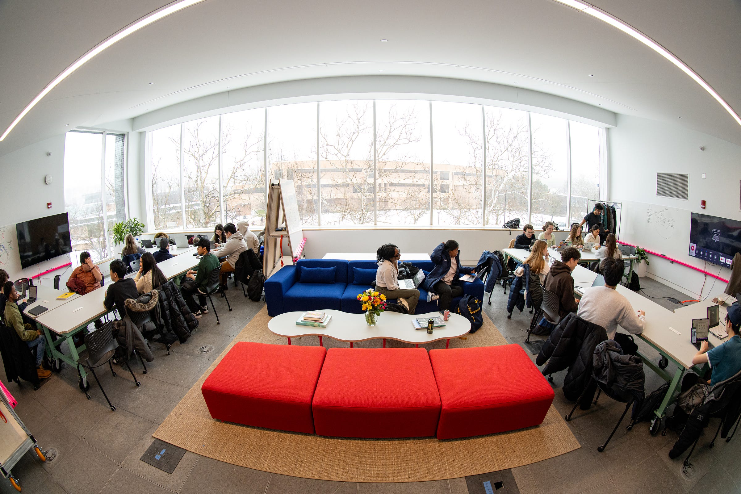
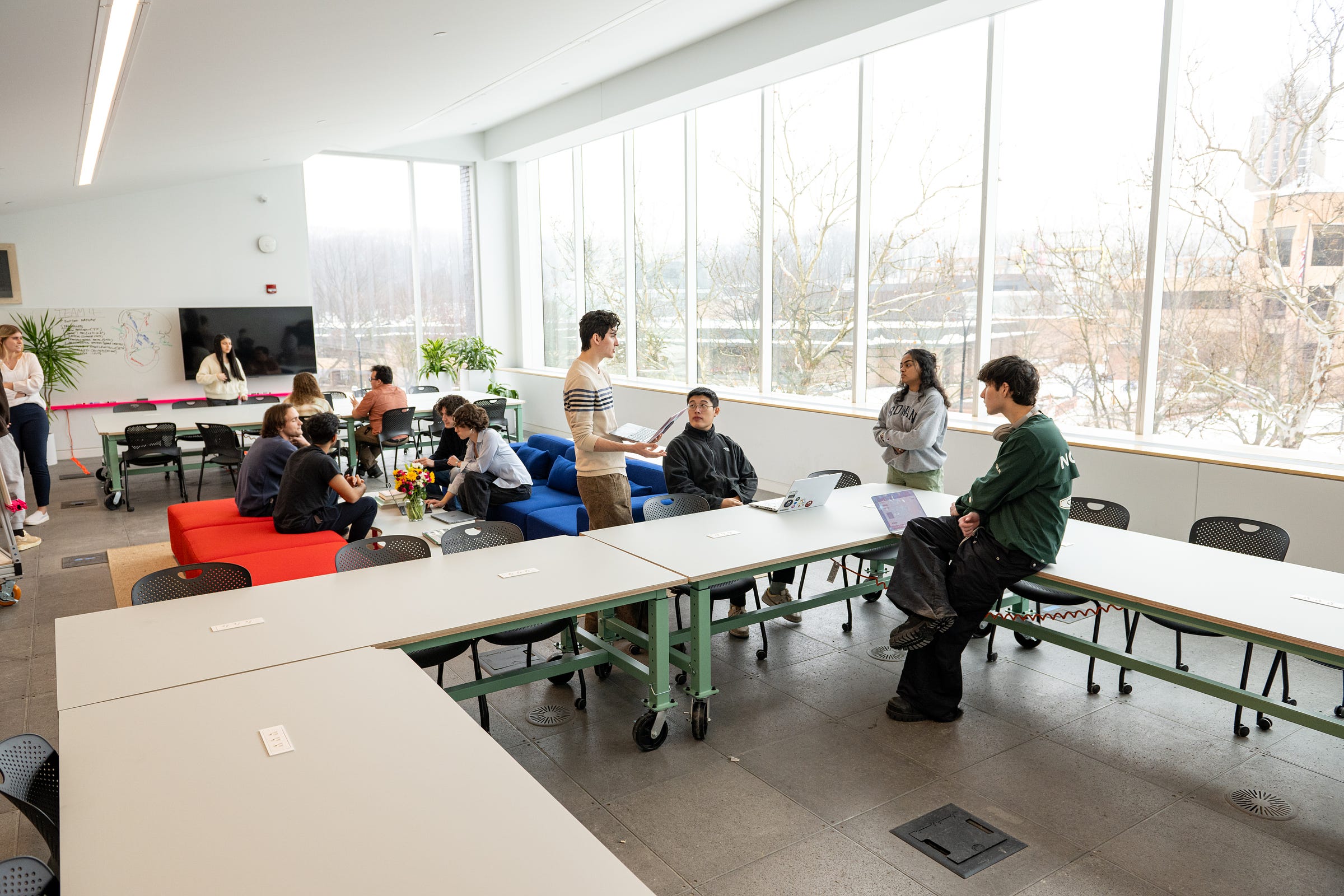
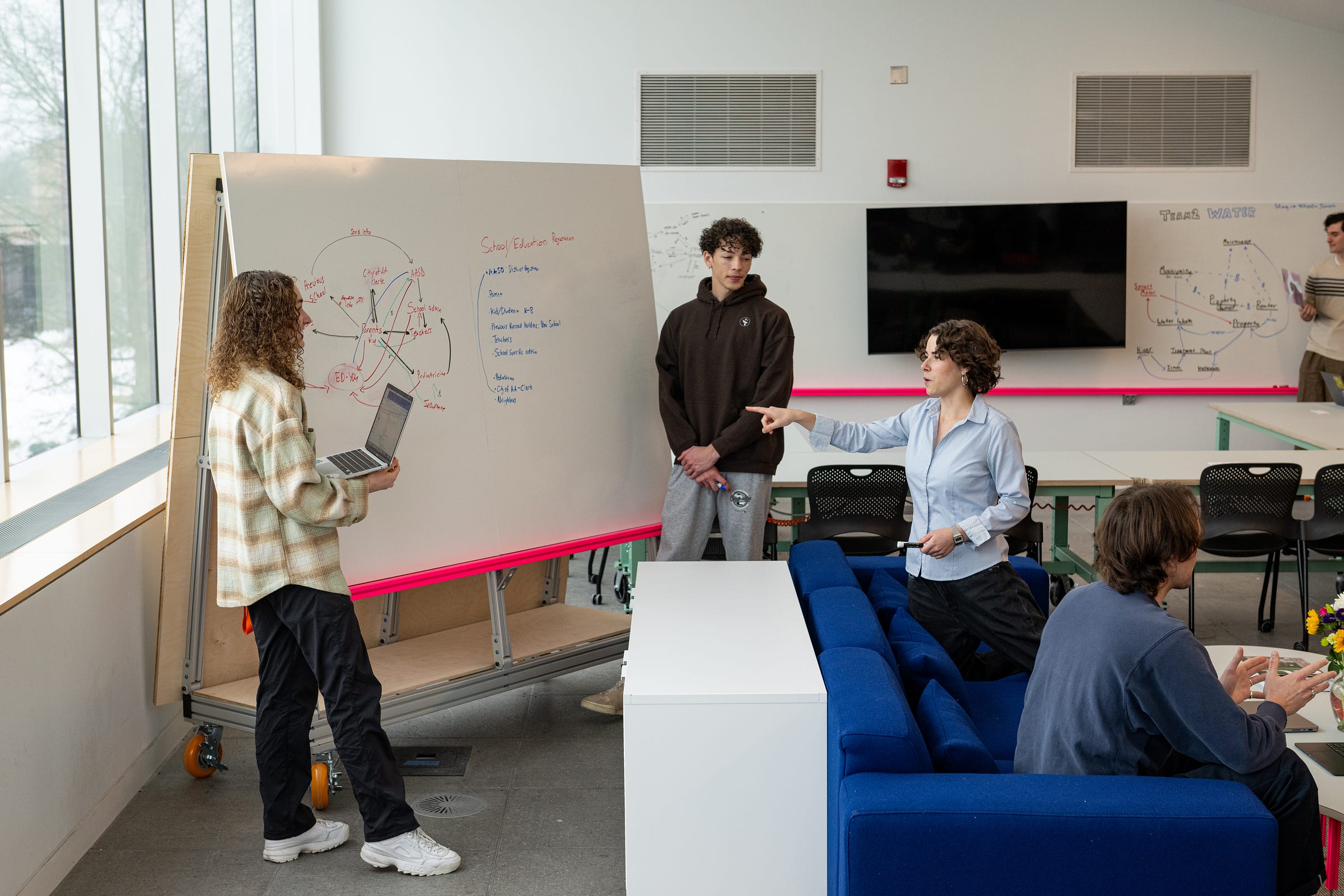
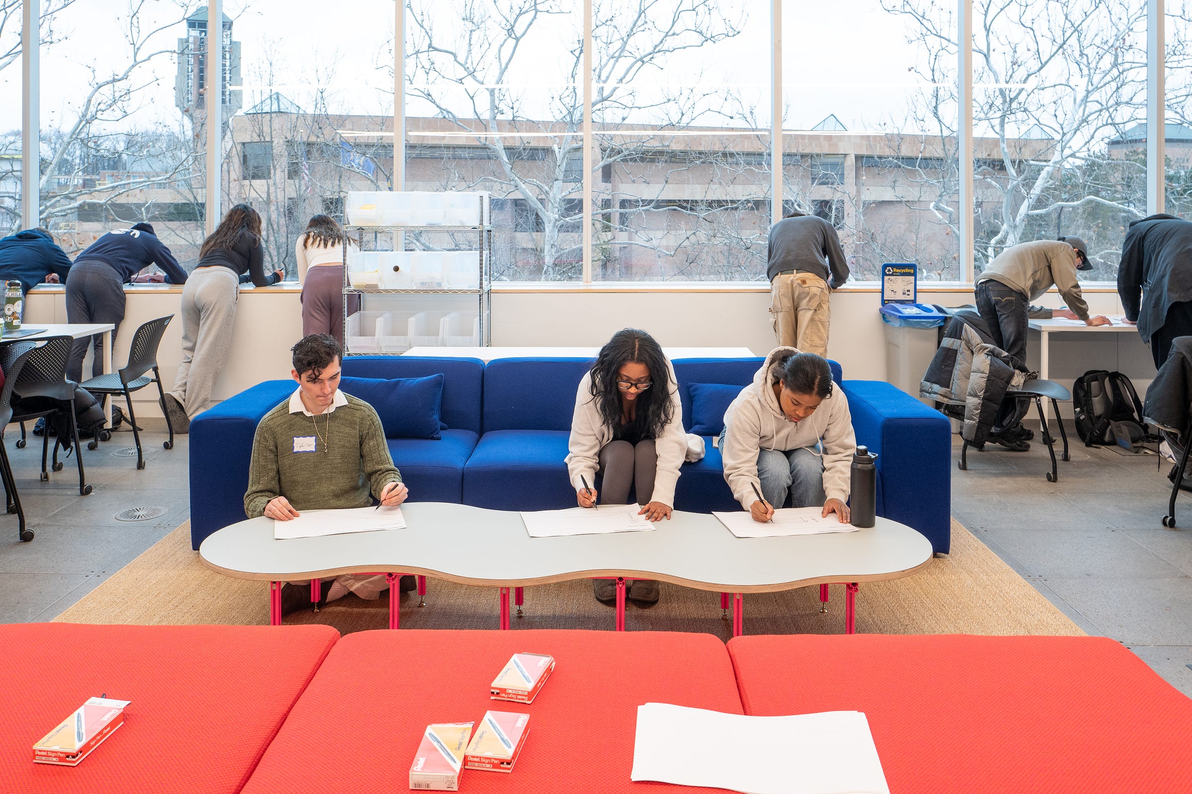
Here’s what the studio looks like, with photos from Eric Bronson. By the way, if studio is a new term for you, it means open workspace where people are working on different hands-on projects, often with music, sometimes with a dash of chaos, always with each other.
Two classroom areas with a soft zone in the middle. At peak time there are 40+ students in this space, so the energy levels are high but so are the decibels. We’re exploring acoustic optimizations now. Studios are always a work in progress.
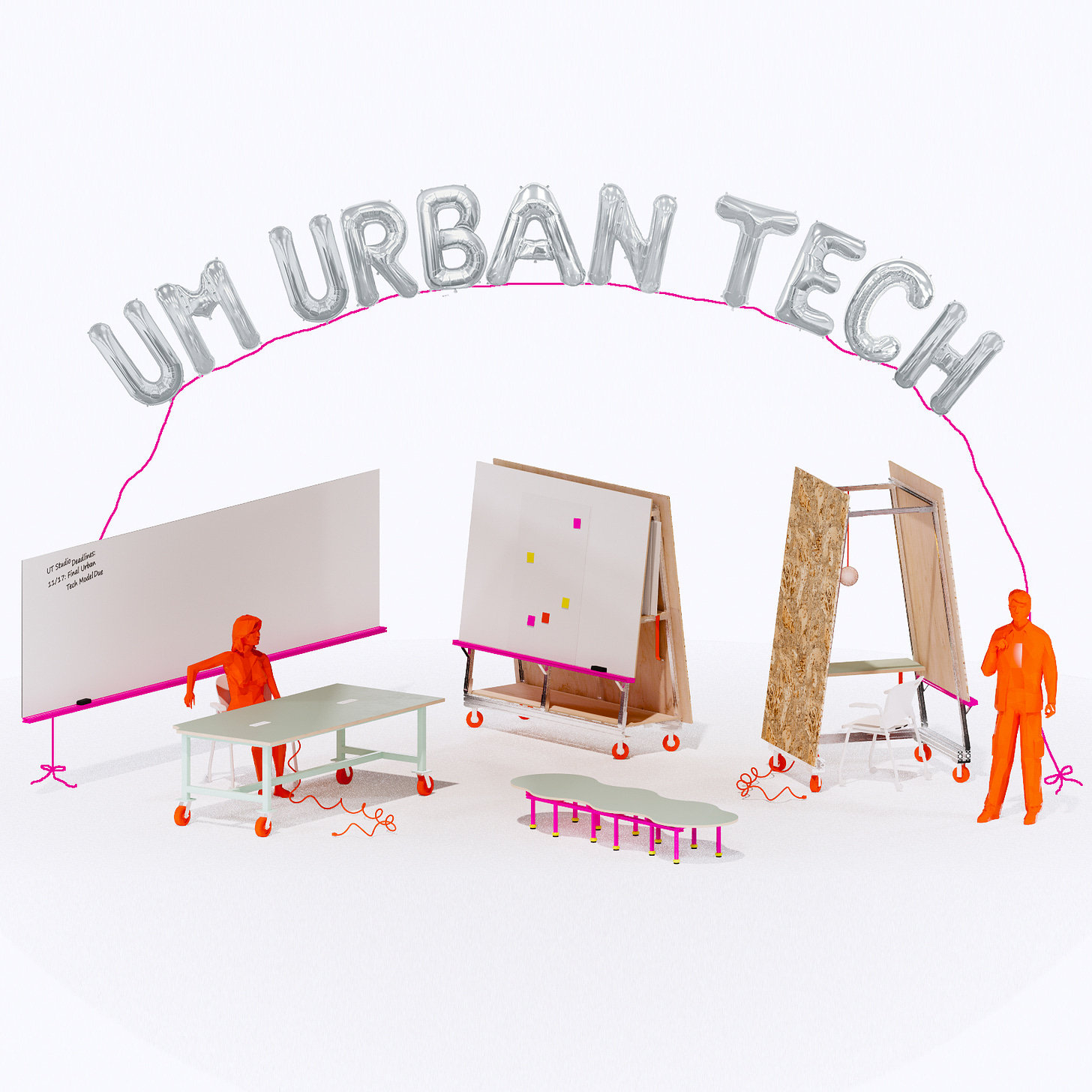
The space lives and breathes with furniture of three types: Rolley Walls, Catertable, and Byte Tables. More on those below. We didn’t move any walls, power, or HVAC. Instead we threw up some whiteboards and AV, and rolled in a menagerie of custom furniture pieces.
There’s that magenta powder coating! All of the elements are designed using the 80/20 system of aluminum extrusions that you find in labs and shops. We wanted the vibe to be refined but open to extension, continuation.
Below is the floor plan drawn by 1+1+ Architects showing the primary two modes of work. On the left you see everyday working with people clustered around tables. On the right is “review mode,” with all of the tables pushed together into one giant venue for us to gather around. We haven’t done a big end of the semester review yet, so we don’t know exactly how that works just yet.
⚙️ UT Studio Mark II - The Process
The first time we ran a studio it was in a leftover space amongst the architects in the buildings. About all we could do was hang some globe lamps and then Elisa started teaching. We always knew that the first semester would inform a real studio build out. That semester also taught us that we needed to be more isolated and also that we needed a different proportion of space—more like a shoebox than a bowling alley. With that experiment under our belt we collaborated with 1+1+ to develop a briefing for the project that included pages like this:
And some text like this:
In AY23-24 Urban Technology will expand from having one studio to three, with 25 students in the fall of 2023 enrolled in studio courses and 60 -70 students enrolled in studio courses by Winter 2024.
Design a system of custom furniture and select off the shelf furniture, plants and objects to create a 1,200 - 2,000 SF work and learning space for urban technology students.
The project had to satisfy functional and cultural needs for our growing degree program, and it had to do so inconclusively. We’re in year three, so we don’t know everything yet. Things will change, and so will our space. That’s part of the fun, but it made the design task more challenging.
The last piece that became part of the briefing was the method of delivering the project. Given that we’re the College of Architecture and Urban Planning, I felt strongly that we should use in-house resources. Of course we worked with a faculty member to design the space. Laura Peterson of 1+1+ Architects had previous experience designing workspaces, and spaces in general with a humanistic verve, so that made sense.
The result of a couple weeks of 1+1+ designing was a family of furniture that you can see below. The pieces are on wheels or easy to pick up and move. While some of this happens on a daily basis, it’s also important because we may relocate the studio as our cohorts continue to grow. Smart details are integrated throughout, like the A-frames that also store large foam core panels students can use as project boards. The enchanting pops of color help during grey Michigan winter days.
Next we sent the designs off to a local factory to be built. No we didn’t! In addition to architectural talent in droves, we also have fabulous shops, so of course we should make as much as possible in-house. This forced us to figure out how to string together various skills and capabilities in the building as an ad-hoc furniture-making factory.
It worked, but only thanks to the efforts of Laura Wilson, Andy Christenson and Nick Carlson in Facilities; Ken Kalchik in the wood shop; architecture grad student Akash Dhanturi working with Laura Peterson to support the fabrication; and Mariah Evans and Charlie Keenan on the UT team as project managers.
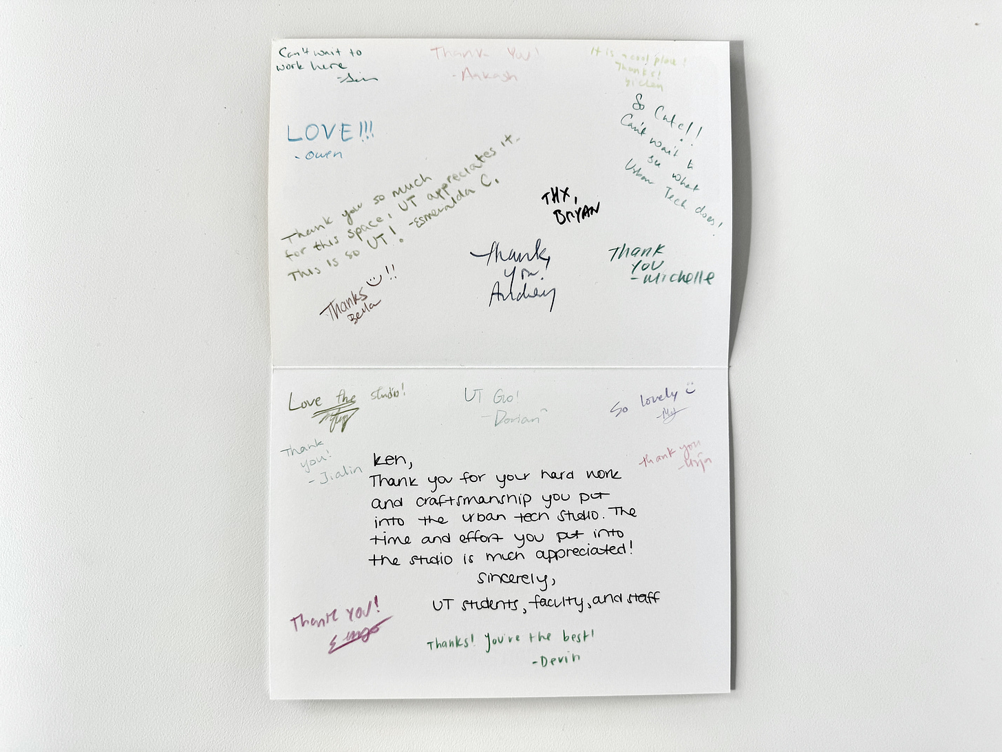
To celebrate the completion of the new studio we put on some music, ordered pizza, threw a party, and signed thank you cards. Culture lives in what we say, what we do, and what we make. The culture I’d like to see grow in this studio space is one of care, expressed in ways spanning from the profound to as simple as a genuine thank you note.
🎙️ Interview with Laura Peterson
Laura Marie Peterson is an architect, artist and educator who led the product development of the WeLive co-housing units, the concept design for the Henry Ford Center for Sustainability, and a ground-up housing and zoning proposal entitled How to Build* Our Own Living Structures that received an honorable mention from the City of Los Angeles. Peterson is co-founder of 1+1+ Architects, who brings architecture to new audiences through scaling down by working with local businesses, developers and non-profits, and scaling up by engaging in systematic issues shaping our built environment today, including housing and climate change.
Bryan Boyer: If each piece of furniture in the studio had a theme song, what would they be?
Laura Peterson: If each furniture creature could dance the night away, I imagine they might dance to:
Catertable: DJ Minx - A Walk In The Park (Moodymann remix)
Rolley Walls: Tom Tom Club - Genius of Love
Byte Tables: Cher - Believe
Bryan: What inspired you for the project?
Laura: I love the counterculture and general fashion/set aesthetic of the mid 90s. Lots of different textures, pops of bright colors and weirdos. Hackers (1995) was a great alternative aesthetic inspiration to the all white and silver tech office spaces of the post 2000 (which are generic and uninspiring)...and felt a little more approachable and inspiring—[we wanted it to feel] like, anyone can join the party, anyone can 'hack' and participate in the anti-streamlined tech aesthetic. Remember the 1998 candy-colored iMacs before everything went white/silver? The 90s tech aesthetic was a little more weird, psychedelic and grunge before tech got big big.
Bryan: What’s your favorite city and why?
Laura: Hard question! Detroit, always. Creative places with great music, food, people and creatives that constantly reinvent themselves: Beirut, Berlin, Mexico City, Tokyo, NY, HK, etc...
🏋️ Need an intern for summer 2024? Reply to this email if you’re interested in urban technology students. They have skills in UX design, service design, python, javascript and a zeal for urban challenges.
These weeks: Midterm reviews and studio guests. Career fair and employer outreach. First overview of Cities Intensive with students: round three. Spring break is on the horizon. 🏃


